
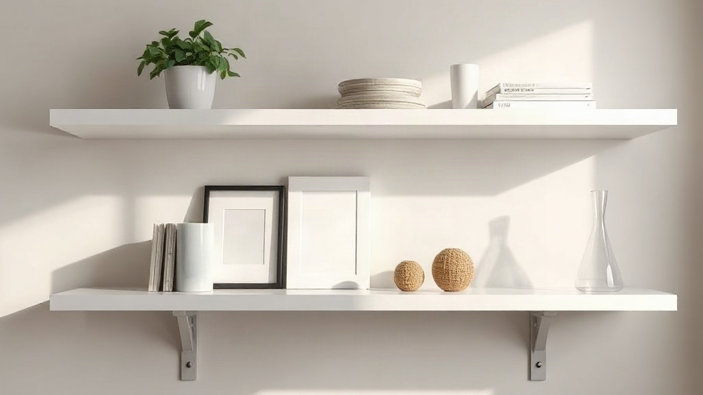
Most shelves fail for a simple reason: they hold too much. When you style a minimalist shelf, the goal is restraint with purpose, not emptiness for its own sake. A well-edited shelf gives each object room to breathe and draws the eye to what matters. Resources such as //homeyplans.com can help you plan the surrounding room, but the shelf itself comes down to a few clear decisions. This guide breaks those decisions into practical steps you can apply to any shelf in your home.
Quick answer: Clear everything off, keep only objects you genuinely find beautiful or useful, and group them in odd-numbered clusters with generous space. Limit yourself to two or three colors, vary object heights, and leave roughly a third of the shelf surface empty. Repeat one material or tone across the shelf so the display reads as one composed scene rather than a collection.
What is a minimalist shelf style?
To style a minimalist shelf is to arrange a small, deliberate selection of objects so the display feels calm, balanced, and intentional. It is a design method, not a shopping list. The result depends less on what you own and more on what you leave out.
Minimalism in shelf styling rests on three principles. First, edit hard: every item must earn its place. Second, create negative space: empty area is part of the design, not wasted room. Third, repeat a visual theme: a shared color, material, or shape ties the objects together so the eye reads one composition.
The difference between sparse and minimalist
A sparse shelf looks under-furnished. A minimalist shelf looks resolved. The distinction is composition. Three objects placed with care and a clear rhythm can feel complete, while eight random items look cluttered even on a long shelf.
In practice, minimalist shelves tend to share a few traits:
- A restrained palette. Two or three colors at most, usually a neutral base with one accent.
- Honest materials. Wood, ceramic, glass, linen, and metal tend to sit well together.
- Functional objects treated as decor. Books, bowls, and vessels do double duty.
- Visible breathing room. Space between groups, and open shelf ends.
Why negative space does the work
Negative space gives the eye somewhere to rest. It also lets each object read clearly as a distinct shape. When you compress items edge to edge, every silhouette competes with its neighbor. When you leave gaps, even ordinary objects gain presence.
A useful mental model: treat the shelf as a small gallery wall laid flat. Each cluster is a framed piece, and the wall between frames is what makes the frames visible. That single shift in thinking explains most of the styling decisions that follow.
Takeaway: Minimalist shelf styling is about editing and composition, not deprivation. Space is a material you work with.
Why styling a minimalist shelf matters
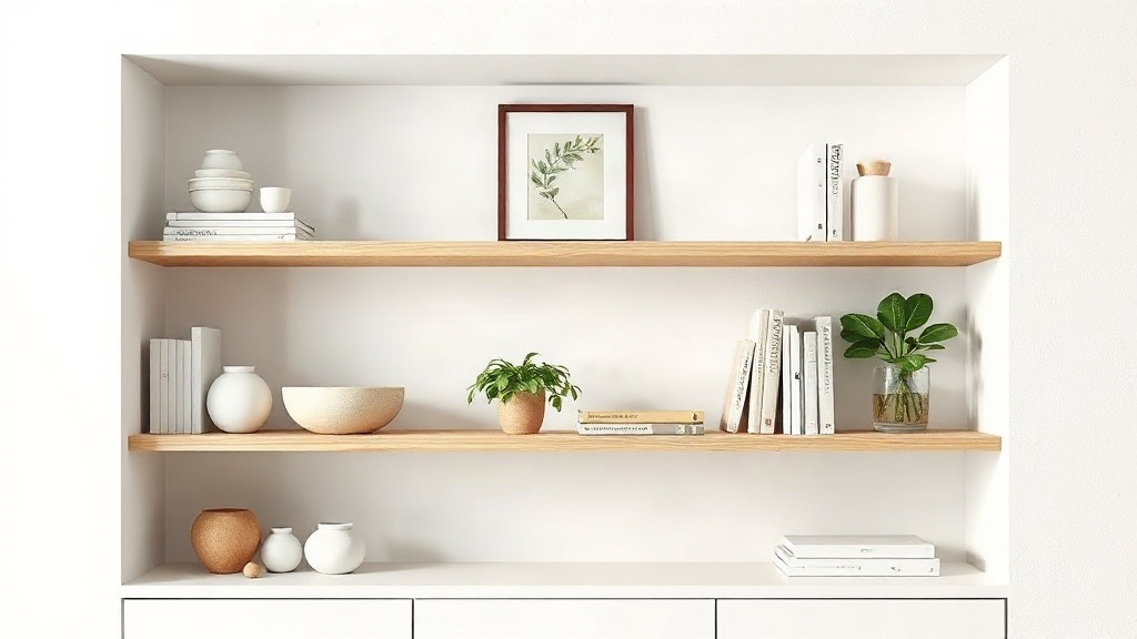
A shelf is one of the first things a visitor’s eye lands on, and it quietly signals how a room is organized. Learning to style a minimalist shelf matters because the payoff extends well beyond appearance. It simplifies cleaning, reduces visual noise, and makes future decorating decisions easier.
Visual calm and perceived order
Busy surfaces raise cognitive load. A shelf crowded with mismatched objects makes a room feel smaller and less restful, even when the rest of the space is tidy. An edited shelf lowers that visual noise and lets the room’s architecture and furniture take the lead. The effect is strongest in small rooms, where every surface competes for attention.
Practical benefits beyond looks
Minimalist styling is also easier to maintain. Fewer objects mean faster dusting, and a clear system makes it obvious where things belong. In our experience, an edited shelf stays tidy longer because there is no pile to sort. Each item has a defined place, so clutter has nowhere to accumulate.
A foundation for future choices
A restrained palette and a small set of materials give you a reference point. When you later spot a vase or a bookend you love, you can check it against the palette instead of guessing. That saves money and prevents the slow accumulation that undoes good styling. If you want more structure around the whole room, the layout ideas at openhousegallery.org can help you coordinate shelf styling with the rest of the space.
Takeaway: The benefits are both aesthetic and practical. A calm shelf is easier to live with and easier to keep.
Best practices
These steps apply whether you are starting from an empty shelf or rescuing a crowded one. Work through them in order, because each one builds on the last.
Start with a full clear-out
Remove everything and look at the bare shelf. Notice its proportions, its light source, and its sight lines. This reset prevents you from arranging around objects that do not belong. Then sort your items into three piles: keep, relocate, and donate. Be strict with the keep pile. A useful test is whether you would notice the item’s absence.
Build around three anchors
Choose three anchor objects with real visual weight: a framed print, a large vase, or a stack of art books. Place them so they form an uneven triangle across the shelf. Anchors set the rhythm, and everything else plays a supporting role. Avoid placing two anchors of equal size and height side by side, because the eye stalls there.
Group in odd-numbered clusters
Objects read better in groups of three or five than in pairs. Odd numbers create a natural focal point and keep the arrangement from looking symmetrical in a rigid way. Vary height within each cluster: a tall vase, a medium bowl, and a low stack of books form a balanced trio. Space the clusters so the gaps are larger than the gaps within them.
Repeat a color and a material
Pick one accent color and one dominant material, then repeat each two or three times across the shelf. Repetition is what makes separate objects feel like one display. A terracotta pot, a terracotta bookend, and a warm-toned print tie together. Without repetition, even well-chosen items look like unrelated souvenirs.
Layer depth and scale
Use the shelf’s depth, not just its width. Lean a framed print against the back wall and place a smaller object in front. Larger pieces belong toward the ends or at the visual center of each shelf section. Keep the scale proportional to the shelf: tiny objects on a deep shelf look lost, and oversized pieces crowd.
Use books as structure
Books are the most versatile minimalist tool. Stack them horizontally as a base for a bowl or sculpture, or stand a short row vertically with the spines aligned. Keep stacks to three or four books and match their tones to your palette. This is where a little restraint pays off most.
Control the vertical rhythm
Cross the shelf with your eye from left to right. The heights of objects should rise and fall gradually rather than spike and drop. A gentle rhythm feels calm and deliberate. If one section feels heavy, remove an item rather than adding one to balance it.
Takeaway: Anchor, cluster, repeat, and leave space. Those four moves produce most of the elegance.
Common mistakes to avoid
Even careful stylists slip into patterns that undermine a minimalist look. The following mistakes are the most frequent, and each has a straightforward fix.
Treating every gap as a problem
The most damaging habit is filling space because it feels unfinished. Resist it. Empty shelf ends and clear gaps between clusters are what make the display read as minimal. If a gap bothers you, wait a week before filling it. Most of the time the urge passes.
Using too many colors
A shelf with six colors has no visual hierarchy. Limit yourself to a neutral base and one accent, then let material texture carry the variety. This is a trade-off worth naming honestly: a tight palette can feel limiting at first. In practice, the constraint produces a more cohesive result than an open-ended one.
Buying decor specifically for the shelf
Purpose-bought decor often looks staged. Start with objects you already use and love, such as a favorite bowl, a candle, or a meaningful book. Add pieces slowly. A shelf styled entirely from new purchases tends to feel generic, while a mix of found and functional items feels personal.
Overcrowding with small objects
Many small items create visual static. One medium object usually reads better than four tiny ones. If you have a collection of small things, rotate a few at a time and store the rest.
Ignoring lighting and shadows
A shelf lit from one side will show shadows that change how objects read. Check your arrangement at different times of day. On a dark shelf, a lamp or a pale object near the center lifts the whole display. Ignoring light is why some shelves look flat in photos and fine in person, and vice versa.
Letting cables and clutter sit in view
Speakers, chargers, and loose papers break any composition. Route cables behind objects or contain them in a simple box that matches the palette. Minimalism cannot survive visible clutter, however good the arrangement around it.
Takeaway: Most failures come from adding rather than removing. When in doubt, take one thing off.
FAQ
Does a minimalist shelf need to be expensive?
No. A tight palette of affordable objects often looks better than a shelf of costly, mismatched pieces. The main investment is time spent editing and rearranging. Use what you own first, then add slowly.
How many items should go on one shelf?
As a starting guide, use three to five objects per shelf section, including book stacks as single objects. This is a guideline, not a rule. Adjust by width, and stop when the gaps start to shrink rather than when a count is reached.
How do I handle a shelf that must also store things?
Combine storage and display by using baskets or boxes in the palette’s main color, and style the top of them. Functional items can be part of the arrangement if their color and material match. Keep the busiest storage on the lower shelves.
Can minimalist styling work with colorful objects?
Yes, if you limit the number of colors. Choose one dominant color and repeat it two or three times, then let neutrals do the rest. A shelf with a single strong color and generous space stays calm.
How often should I restyle the shelf?
Once or twice a year is usually enough, or whenever the objects stop feeling intentional. Seasonal rotation of one or two pieces keeps the display fresh without a full redo.
Conclusion
Elegant minimalist shelving comes down to a few repeatable moves. Clear everything out, keep only what you love or use, and build around a small number of anchors. Group objects in odd clusters, repeat one color and one material, and protect the empty space that makes the whole display legible. Avoid filling gaps and buying decor just to fill a shelf. To put these ideas into practice, start with a single shelf today: clear it, choose three anchors, and rebuild from there. Give the arrangement a week, then adjust one thing at a time rather than rearranging everything at once.